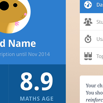
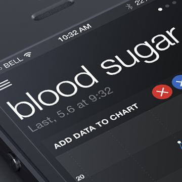
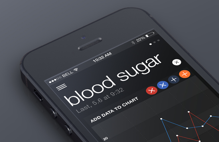
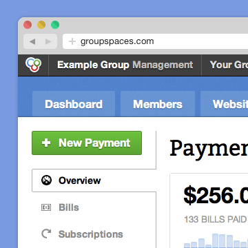
I feel like a headless chicken, running around Plaxo and LinkedIn searching for people to make connections with. What is the real point of social networking, is it just to find people you know already and share stuff with them, stuff you could share relatively easy in other ways. It all feels a bit empty tonight.
When researching a site we made at Kwiqq for Play N Trade I did some research into gamer social networks. The best of class was GamerVision.com, there was lots of chatter, users adding posts, commenting on each others opinions and all the rest. I was reminded of this in my headless chicken state and it brought me back to the real point (in my mind) to social networking, to expand your horizons and interact with people you may not have met but share similar experiences. This must be a strong reason for socialising in this medium but I think it is one that is too often overlooked.
This is something I will keep in mind at the start of a project with the blank canvas. How do you allow the users of the network interact comfortably with those they don’t know. I am sure this could be easily built into the system, and in some cases like GamerVision is done very successfully.
The experience also make me pleased to be working at Kwiqq because we build the sort of niche social networks that users need, as an antidote to networks of headless chickens.

At Kwiqq I love working with web tools that make my life easier. Whether it’s everyones favourites like Flickr or Dopplr or speciality applications like Protoshare. Recently we have started to introduce our clients to the benefits of online apps.
In an effort to gain a more accurate visual design style for our clients we have started to use Backpack and encouraged them to develop their own mood boards through this well designed and easy to use product. Getting a client set up with a Backpack account a couple of weeks before the project starts will really speed up the design process.
The beauty of this method is that, ideas they have that may fall outside a meeting or don’t seem relevant enough to put down in an email can all be added to a Backpack page as images, lists, links or files. As their pages develop you begin to get a clearer picture of their exact requirements and are therefore more likely to nail the design in the first sitting rather than offering many choices.

This application is easy to use, won’t confuse clients and provides a nice space where clients can just brain dump all their thoughts and get your designers mind working.
One of the ways I increase my productivity when designing complex web applications is to not do anything!
Quite a few people will be familiar with the Chinese philosophy of not-doing so I wont elaborate too much but in essence it allows things to happen rather than trying to have to much effect over circumstances, read Lao Tzu if you want to know more.
I have found this method to aid the design process greatly, in that when faced with complex problems it is best to do all the thinking and planning you can and then just to sit back and let the other part of your brain do the rest. Go for a walk or play with the kids and most importantly do nothing towards the project.
It can be quite difficult to stop the mind from trying to solve the problems analytically but after a while you will get better at it and then PING the answers you were looking just appear in your head fully formed and beautifully solved. When I am at work and I need to access this kind of mental state I go for a walk around the beautiful Sussex Downs countryside that surrounds the Sussex innovation centre.

Give it a go. Oh and to make the whole process easier take up Tai Chi
All this talk of ubiquity reminded me of a book I read recently called Digital Korea, in this book the author described how technologically advanced South Korea was with super fast broadband, online gaming, mobile payments etc. Also mentioned was the ubiquitous dream hall (sounds odder than it really is) which is Korea’s example of a world of the future sponsored by Korean technology companies where technology is completely ubiquitous.

The problem is that they aren’t really keeping things as up to date as they should with the last update in April 2007, certain technologies in the dream house have begun to be replaced by newer versions. This got me thinking about usability and how technology can hinder rather than help.
I suppose we all know that, and have all experienced it first hand, but from a design view point it is always necessary to recognise the limitations of technology. To do this I usually employ a method I borrowed from Designing the Obvious where you approach a design problem from the point of view of aiding the user to complete a task. The user may not really care for your beloved app but what they really want to do is share their photos quickly and easily with family members, for example. So to create the best possible user experience you design the best way for them to do just that, it’s that simple. And what is best about this approach is that it’s not determined by the technology available.
I have been playing around with the new Ubiquity plugin for Firefox for a few hours and can already see the massive potential of this project.

I discovered this project after reading Jono DiCarlo’s blog post about linguistic UIs, in it he was discussing the difference between using a noun as a connection for a user and using a verb. Since a noun can only name an item it increases the level of abstraction for the user whereas a verb provides direct access to the action the user will be completing.
It is this point which the Ubiquity plugin excels in. The user simply types a command into the ubiquity box (which appears using a keyboard shortcut) and is then able to carry out the function they require directly and responsively within that box. So for a map type ‘Map (place name of choice)’ or ‘We’ for weather followed by your Zip or Postal code or even for email just type email then select from your list of contacts and fill in the message content (currently only working with gmail).

The beauty of this design is that for tasks that you carry out every day you no longer need to open multiple tabs or visit multiple sites, simply open your ubiquity box and gather the information you need. I believe the possibilities for this project are endless and will really improve the way in which we interact with the information the web contains especially on mobile devices where opening multiple pages gets a bit fiddly.
Well done Mozilla!

As a designer you have to be careful what language you use to communicate information to users. This could mean naming conventions in navigational elements or using easier to understand language to name links (based on my previous posts this may be naming at the genus level). Beyond this are the new interfaces beginning to be developed that are able to push these boundaries even further and provide the user with a much simplified interaction through something we are familiar with before language - movement.
Consider these developments in this new wave of interface design.
Aurora browser concept is a browser designed by Adaptive path it uses bodily movement. Aurora explores new ways people could interact with the Web in the future based on projected technological trends and real-world scenarios. The Aurora browser displays the history of sites you have visited depending on semanitcs, tags and timeframe, these are then collected into clusters that can be sorted using hand and arm movements.
Microsoft Surface is a Multi-touch product from Microsoft which is developed as a software and hardware combination technology that allows a user, or multiple users, to manipulate digital content by the use of natural motions, hand gestures, or physical objects.
Both these examples show a move beyond language and interpreting design through gestural interfaces. There seems to be a rush of new design concepts looking to exploit the advances in gestural concepts and since these interfaces are beginning to appear on more and more phones (iPhone, Samsung etc) it will soon become a familiar tool for everyday people to use.
The most interesting development for me is that language can form a barrier between the user and the interface, this barrier can be removed or curtailed simply by understanding the way in which the human mind interprets language but as gestural technology advances these barriers are being broken down even more. Consider how much easier the iPhone is to use simply by removing the complicated sets of buttons that vary from phone to phone and allowing the use of the everyday buttons everyone is familiar with. This is the future of interaction design as it provides the user with a direct experience of technology through direct interaction rather than a communicated response.
For the second installment on the psychology of design, I would like to write more about the research behind my theory before concluding the series next week with how these principles can be directly applied to web design.
It begins with Eleanor Rosch, a professor of psychology at the University of California, Berkeley. From field experiments she conducted in the 1970s with the Dani people of Papua New Guinea, Rosch concluded that when categorizing and understanding an everyday object or experience, people lump items together in terms of those most representative of the group. For example, when asked to give an example of the concept furniture, chair is more frequently cited than stool.
This theory was developed into Prototype theory which basically shows that some members of a category are more central than others. Research has shown that generally people will center their experience of the world around central members of a category, so in our example, for furniture it is chair. This is where the theory begins to take shape as if this central point exists then in most cases it can be used as a means of making an interface more understandable to more users.
If there is one common level of thought that people use to interpret the world around them then the most simple and widely understood functionality should be used in order to keep in touch with the experiences of the people for whom we are designing, any break from these norms will most likely cause confusion.
For a designer I think this means ’stick to what you know’ and also what others are familiar with. There is in some cases an argument for highly graphic interfaces but in most cases that will only confuse the user. I would rather turn my design skills towards adding clever additional functionality without the user being pushed too far beyond their comfort zone and remain with the prototypes with which they are familiar.
Recently I have had to put some serious thinking behind how large numbers of users can most successfully be encouraged to progress through an interface. Using some research I have carried out I am going to write a series of blog posts on the psychology of design.
One of the major influences on the way we experience the world is language. The world of language is divided into categories, it is this categorization that helps us to forge links between stuff. Professor George Lakoff shows that this categorization can vary amongst the languages of the world, for example there is an Aboriginal tribe that place Women, Fire and dangerous things all under one category i.e they all share similar characteristics, some of which I’m sure we have all experienced.
A couple of guys called Roger Brown and Brent Berlin discovered that it is most common for stuff to be categorized at the genus level, so with trees for example, Oak, Maple, Ash etc. So if there is one central naming level that humans seem to prefer when communicating to one another then these basic principles I believe can be applied to design.
If this level of understanding is common to all language then it is the base point to design from. Certain naming conventions could be adhered to in order to maximize user understanding and therefore usability.
Think of easier to understand navigation buttons, more relevant page copy, links with meaning. If effort is made, wherever possible, to use the genus level to name then it should in theory make a site more usable by attaching those names to a more fundamental and relevant part of the language everyone uses.
I will be blogging more about these ideas in future so stay tuned.